Run the following SQL query on the graph_unify_loop_${N} (or graph) table for each iteration, and download the resulting data as a CSV file.
SELECT
  CONCAT('"',leader_id,'"') AS leader_id,
  CONCAT('"',follower_id,'"') AS follower_id,
  '' AS node_label,
  '' AS node_shape,
  '' AS edge_label
FROM ${canonical_id_name}_graph_unify_loop_${N};
Example output:
| leader_id | follower_id | node_label | node_shape | edge_label |
|---|---|---|---|---|
| """aaa_001""" | """3rd_008""" | |||
| """aaa_001""" | """3rd_013""" | |||
| """aaa_001""" | """3rd_005""" | |||
| """aaa_001""" | """xxx_004""" |
Open the CSV file in a text editor and replace all instances of '""' with ''. This will clean up unnecessary quotes around the values.
Edited example:
| leader_id | follower_id | node_label | node_shape | edge_label |
|---|---|---|---|---|
| "aaa_001" | "3rd_008" | |||
| "aaa_001" | "3rd_013" | |||
| "aaa_001" | "3rd_005" | |||
| "aaa_001" | "xxx_004" |
Ex. Use the 3rd party service - https://docpose.com/csv-to-dot
In this guide, we process and visualize histogram columns such as histogram_${key_name} from the result_key_stats table. Using SQL, we transform these columns into a structured format and plot histograms and pie charts for insights.
| from_table | total_distinct | distinct_with_email | distinct_with_td_client_id | distinct_with_td_global_id | distinct_with_td_ssc_id | histogram_email | histogram_td_client_id | histogram_td_global_id | histogram_td_ssc_id | time |
|---|---|---|---|---|---|---|---|---|---|---|
| * | 1909226 | 30579 | 1909096 | 1908998 | 680373 | 1:30247,2:311,3:14,4:4,7:1,25:1,31:1 | 1:1738227,2:115270,3:26894,4:10851,5:5474,... | 1:1575567,2:166595,3:69711,4:27998,5:16761,... | 1:563326,2:96817,3:12685,4:3563,5:1579,... | 1689326177 |
The following SQL extracts, normalizes, and formats histogram data for plotting. It includes logic to handle missing x-values and calculate percentages for each bin.
WITH tbl_histogram AS
(
  SELECT
     CAST(SPLIT_PART(elm, ':', 1) AS BIGINT) AS x,
     CAST(SPLIT_PART(elm, ':', 2) AS BIGINT) AS num
  FROM (
    SELECT
      SPLIT(histogram_${key_name}, ',') AS hist_ary,
      ROW_NUMBER() OVER (ORDER BY time DESC) AS id
    FROM ${canonical_id_name}_result_key_stats
    WHERE from_table = '*'
  )
  CROSS JOIN UNNEST(hist_ary) AS t(elm)
  WHERE id = 1
),
tbl_serial_numbers AS
(
  SELECT val
  FROM (VALUES (SEQUENCE(1, 100, 1))) AS t(seq_ary)
  CROSS JOIN UNNEST(seq_ary) AS t(val)
)
SELECT x, num, num * 1.0 / SUM(num) OVER (ORDER BY x RANGE BETWEEN UNBOUNDED PRECEDING AND UNBOUNDED FOLLOWING) AS percentage_of_total
FROM
(
  SELECT x, num
  FROM tbl_histogram
  UNION ALL
  SELECT x, 0 AS num
  FROM (SELECT val AS x FROM tbl_serial_numbers)
  WHERE x NOT IN (SELECT x FROM tbl_histogram)
)
ORDER BY x
LIMIT 100;Percentage Calculation
percentage_of_totalcomputes the proportion of eachxrelative to the total.Histogram Bin Range
SEQUENCE(1, 100, 1)ensures the x-axis ranges from 1 to 100, even if certain bins are missing.Row Limit
LIMIT 100restricts the output to the first 100 bins.
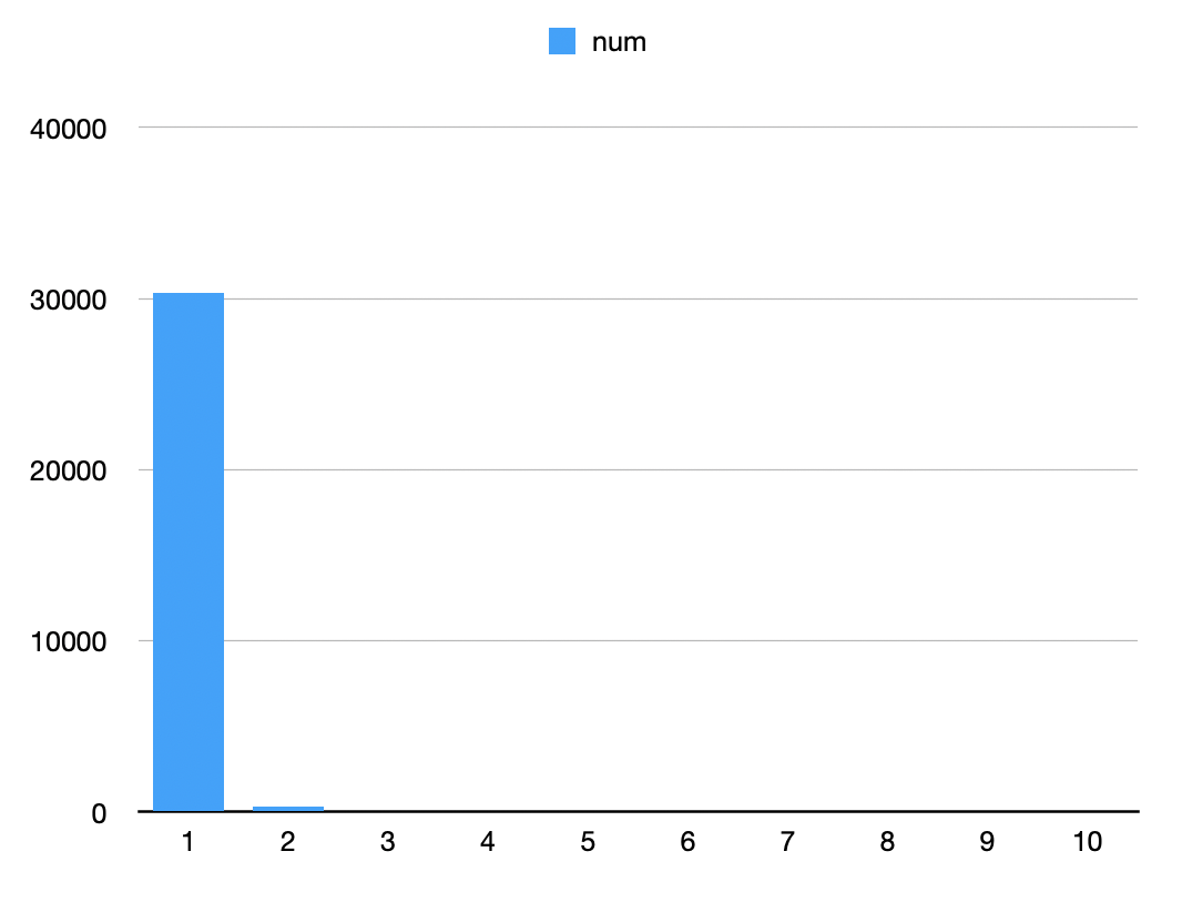
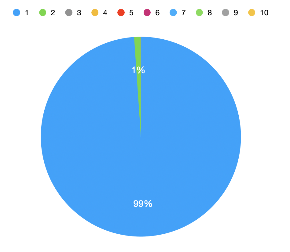
| x | num | percentage_of_total |
|---|---|---|
| 1 | 30337 | 0.99 |
| 2 | 313 | 0.01 |
| 3 | 14 | 0.00 |
| 4 | 4 | 0.00 |
| 5 | 0 | 0.00 |
| ... | ... | ... |
- Most
canonical_ids are mapped to only oneemail. - Small counts exist for multiple
emailspercanonical_id.
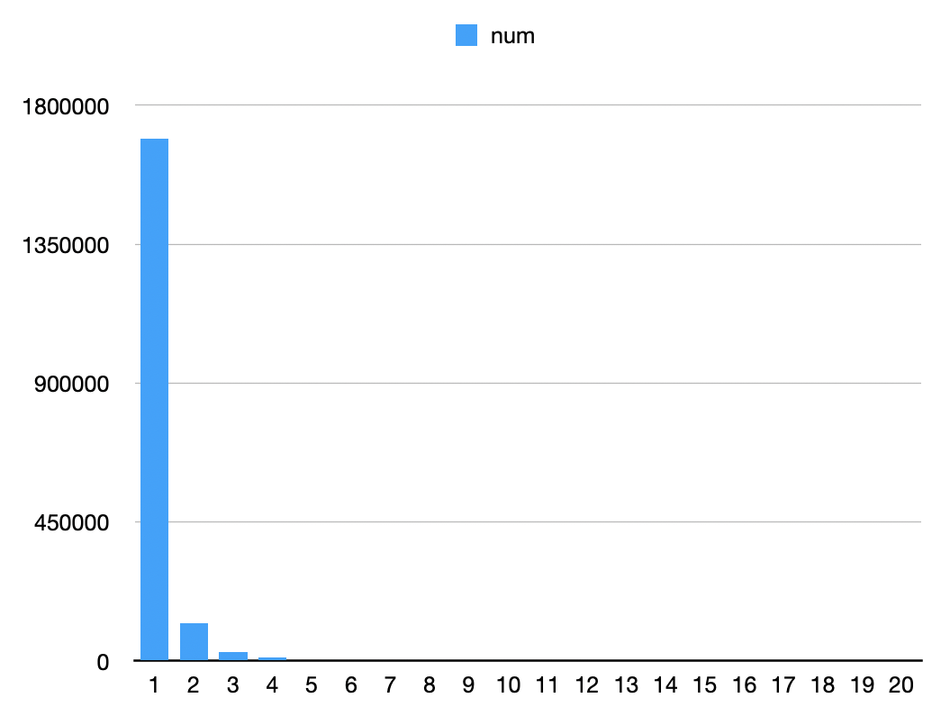
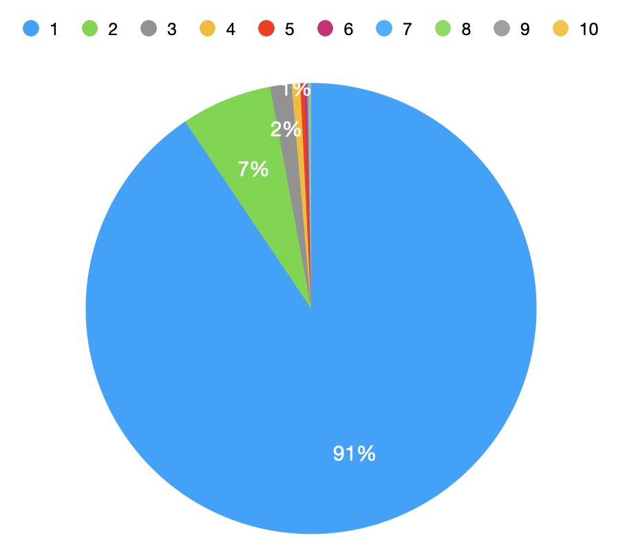
| x | num | percentage_of_total |
|---|---|---|
| 1 | 1690899 | 0.90 |
| 2 | 121851 | 0.07 |
| 3 | 28552 | 0.02 |
| 4 | 11489 | 0.01 |
| 5 | 5783 | 0.00 |
| ... | ... | ... |
- Majority of
canonical_ids correspond to a singletd_client_id. - Potential reasons:
- Many users interact briefly, resulting in only one
td_client_id. - Incomplete stitching of
td_client_ids across sessions.
- Many users interact briefly, resulting in only one
Stitching Accuracy
Results reflect the accuracy ofcanonical_idstitching. High counts forx=1may indicate insufficient linking across identifiers.User Behavior Patterns
Distributions help identify how users interact with your platform (e.g., single or multiple identifiers).Data Quality
Missing or misaligned data may result in skewed histograms.
By visualizing these patterns, we gain deeper insights into user identity stitching and potential areas for data enhancement.